🗺️ Level Design
Ah the cursed topic of experts and fools alike..
Level design is an art. If you think your map naturally looks like trash don’t despair. It’s a learning process. Despite your skill level the feeling may seem never ending (look up imposter syndrome) so its important to just have fun.
You should see what the first drafts of my KFO map looked like, yeesh (oh yeah, I’ll prob still never release it xD)
These next sections include my key thoughts/reference. If you’re here for tips and tricks I have this clickbaity thing hidden behind my ear: 👉 https://www.gamasutra.com/blogs/TomPugh/20181022/329044/Level_Design_Tips_and_Tricks.php Ew. I suppose that could work for you.
You NEED a theme and/or narrative (before/after outbreak)
Browse through your camera roll, Pinterest, GettyImages, historical eras, historical events (doesn’t fit lore but who cares xd), memorable places, movies, books, shudders other games and so on. This should help you pick a setting including theme (e.g: wintry maze-like wonderland, horror sex dungeon etc.). Consider an emotion-based theme (curiosity, spooky, comedic, ironic [wait that’s not an emotion…]) and build a mood board by gathering plenty of reference images.
TIP 1: KF is gonna be gritty and hard themes obv. TIP 2: You can also consider easy cataloguing software like Allusion + PureRef:
Planning
Your time is priceless, so the idea in standard GameDev is every asset supports your main theme, narrative or core mechanic. It might be cool to squeeze a fancy church cloister into map A but just put it in a notepad and design a different map at another time where a church is more relevant.
So how does a plan full of rectangles even envision a theme? I’ma fall back on experts here v24 (see below):
Optional/KFO
Lighting Note
For planning in this GameEngine, note the honourable mention for lighting: lightmapping is based on BSP size. So, for consistency, any bigger rooms should be split into equal-ish sizes of BSP brushes while developing your map.
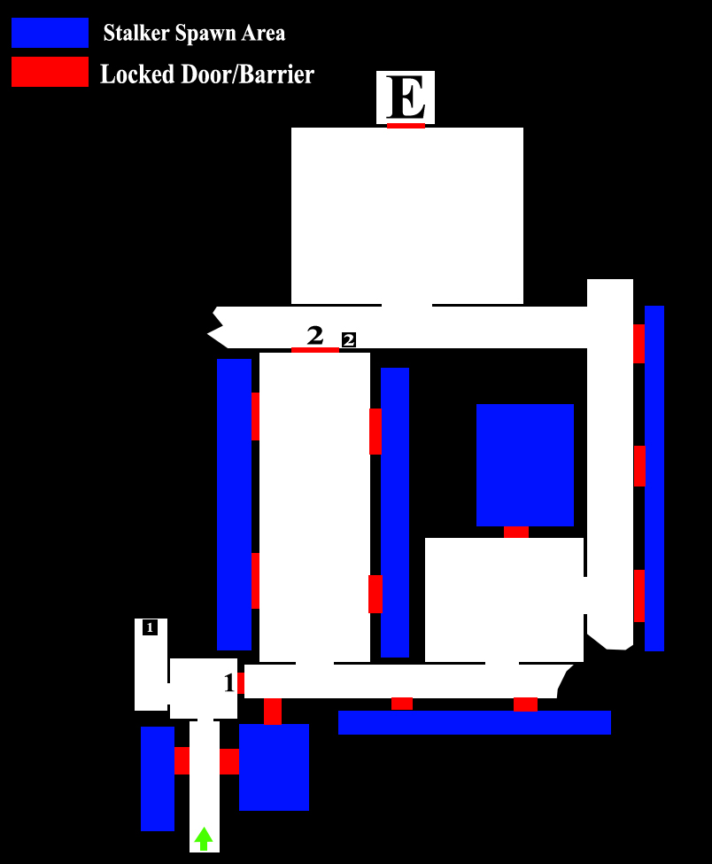
Sketches or low quality 2D blueprinting also help. Here’s an early plan me and my partner used for our KFO map (what is it missing?):
Dimensions
Don’t be like every other average Joe — plan like you’re drafting blueprints as an architect (although not as pretty as them). You’ll make life easier down the line.
As for KF planning → Follow this dude’s advice (he sounds smarter than me):
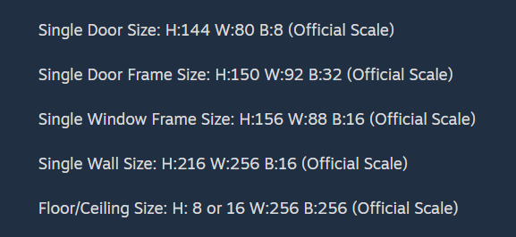
Keep everything simple and wide (>200 width for walkable SM, >256 for BSP). This helps both the dumb specimen pathing and player navigation.
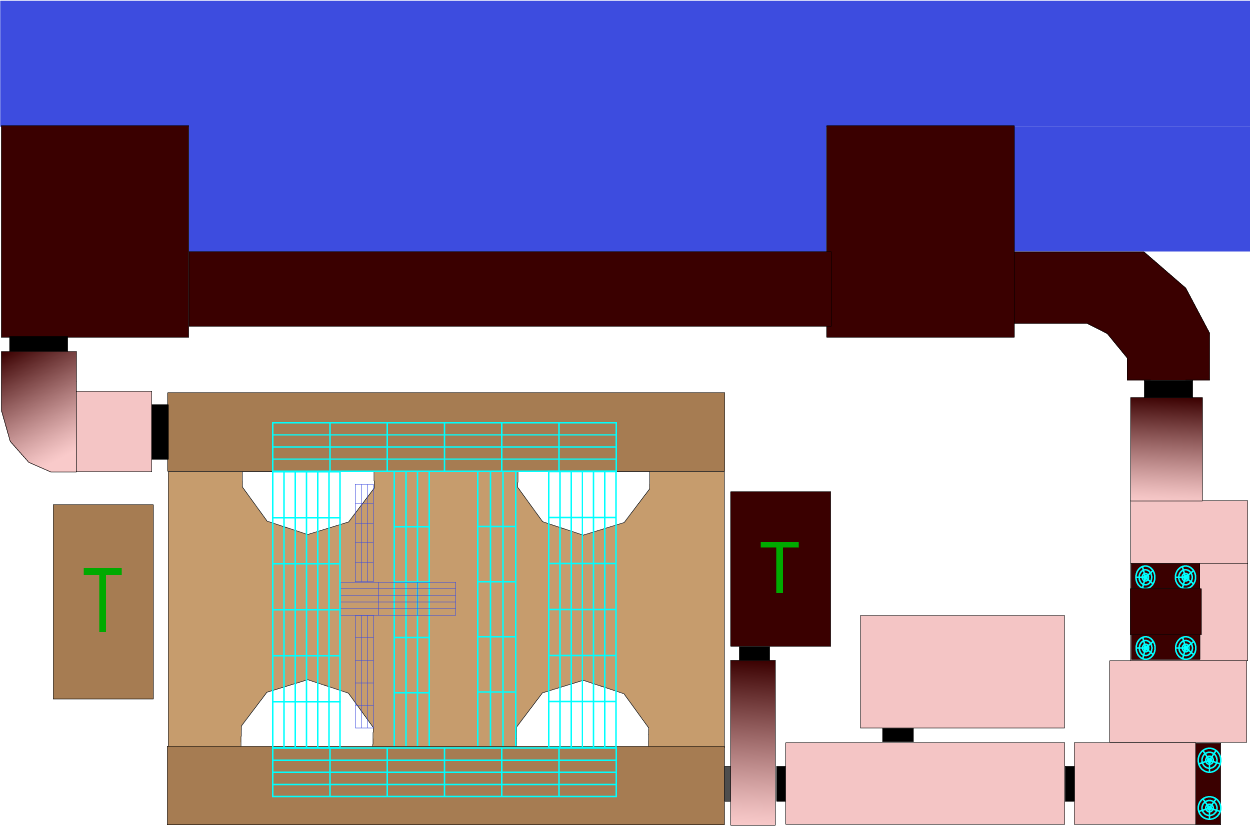
Also build in sightblockers — good level design naturally optimises performance. Use valleys, walls, or fat decorations (for antiportals) to limit render load.
Example:
Greyboxing
Now you can build a Greybox/Whitebox map. Slap in the basic geometry, doorways, spawns and paths, then focus on how it plays.
Are there a billion dead ends? For example, observe the design above. My final map implements at least 2 more rooms. Role-play as an alien/1st timer, do parts frustrate you? Ignore SM and decorations for now, once you properly start you just spam ctrl+c & ctrl+v anyway. Stress-test the pathing (w10+ spam). Can you mix fun pathways without breaking kf-pathing (no xD), can you theoretically or literally punch holes in walls to compromise?
Always underestimate KF pathing.
Custom Assets & Lighting
You’re unlikely to make your own SM/3d model assets as a beginner (or with 2010 software), so stick to textures/sounds for custom stuff. Build a test map for combining/utilising/scaling assets in isolation.
Lighting is a super powerful tool but also a crutch, so do it last. To support your theme easily, pick a hue and mess with saturation + brightness :P
Pro Tip: If you already know your theme, feel free to do lighting before texturing. Pro Tip 2: If you need it:
KFSlot_Ammo_Pickupfrom Frightyard — 100% consistent ammo spawns regardless of difficulty (credit: braindawg)
Bonus Stuffs
What’s the point of making maps if you can’t have a little FUN? Easter eggs are a great way to encourage players to explore and appreciate your map’s decorations.
Example: KF-SawnOfTheDead

10/10
It plays on everyone’s mutual hate of sirens using stock decorations projectors cleverly disguised as light.
Well optimised, no extra downloads required.
As mentioned in the Optional Video, interactable and relevant parts of a map (doorways) should be highlighted in some way.
This can be done with brighter lighting (/projectors), pickups used as breadcrumbs, SM’s such as pipes, fences, textures or if you think like an artist, guiding lines of path-like geometry (Composition baby).
Basically the guidelines could even be sound.

Never forget, Players are DUMB. (Delightable Underwear Munching Bums), so leave more than 1 clue for pity’s sake.